Sunday, December 2, 2007
Featured on Standard Deluxe Site
The invitations I designed for our wedding in 2004, and a few tee shirts I designed are featured on the Standard Deluxe website. Check it out! Link here: Standard Deluxe.
Friday, November 2, 2007
2008 Cartoon Network Calendar Page Sneak Peek
This is from the annual CN calendar that our design group puts out. Our group developed this self-initiated/self-directed project back in 2000 I think and we've been doing one every year since. Unfortunately this never sees consumers, so only a select few outside Cartoon Network actually get them. The upshot, though is that we're our own client so we get to take liberties we normally wouldn't be afforded on other projects. We each get a month and get to interpret it more or less how we want. This is my contribution for June, it's for the upcoming show Secret Saturdays by Jay Stephens (of Tutenstein, Oddville & Jetcat, Chick and Dee, and Land of Nod fame). This was concepted by me and Clint Carruth our Sr. Writer, pencilled by Juan Ortiz, inked by Mark Prudeaux, and colored, typeset, layout and P'shop effects by me. I'm really thrilled with how it came out, Juan and Mark did a fantastic job. They made it incredibly easy, thanks guys!
Friday, October 26, 2007
Digital Monoprint #2 Eureka?
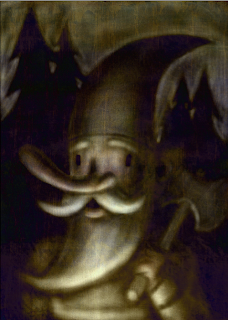
HUGE Thanks to Jon for sending some Monoprint Photoshop brush textures he found. This actually is a tremendous help towards getting a more realistic texture. I created this bg with the brushes, copied it into the gnome file and then used the Difference filter at an opacity of 60%. The result is kinda spooky... Then I tweaked the contrast/brightness of the original image and added some more highlights back in.
I'm trying to shoehorn it after the fact here, so I think if I were to start over with the new bg, more fun things would happen. I'll keep messing around and post the results.
Thanks, Jon!
Thursday, October 25, 2007
In progress Digital Monoprint 2
Friday, October 19, 2007
Real Monoprint
As mentioned in my last post, here's the real McCoy. It wouldn't all fit on the scanner bed, but you get the idea. Since the ink is oil based, there's a bit of viscosity so neat things can happen and it can hold the textures of objects. You can also ink over top of your original wipeouts and add more colors. I think this was a 3 color experiment. This was probably circa 2000-2002.
Thursday, October 18, 2007
Digital Monoprint
Awhile back I visited a monoprint class that Mr. Mofongo was attending at the former Atlanta College of Art. The teacher was gracious enough to let me do a plate and try it out. Look for that in the next post. Fast forward to last year: I had the idea to try the same technique of extracting an image out of a solid dark color with varying photoshop brushes and the eraser tool. I finally had the time to sit down and try it out. I think it turned out ok for a first attempt. The undo feature is a great tool here to test out different tones and mark making, but unfortunately this method doesn't allow for the spontaneous effects and things that are inherent in pulling ink off a plexiglass plate. Still, it's a pretty neat effect and I'm sure lots can be simulated with the right brushes and texture overlays. Definitely something to keep trying and experimenting with...
Monday, October 15, 2007
Sunday, October 14, 2007
Real Brushwork Flash
I've pretty much tapped my harddrive for goodies, however I did find some old sketchbooks looking for the Star Wars drawings in the previous post. I found some good stuff so I'll continue to post the harvest. This was a drawing of the Flash done with a real brush pen and some black watercolor on natural paper. It may not come through the scan, but the really rich matte black of the watercolor is pretty cool in person on the kraft paper.
Give Me Liberty or Give Me Star Wars
Saturday, October 6, 2007
Fark.
Friday, October 5, 2007
Voodoo That You Do
More hard drive excavation revealed this little ditty from 2002. My recollection was that I had just purchased a Wacom Graphire tablet and I was testing out the brush pressure sensitivity in Illustrator. It's a decent color sketch, might be something good to build upon as one of those new pieces I've been rambling about.
Wednesday, October 3, 2007
A New Piece! Digital Inkwork in Illustrator CS3
Okay, okay... It's not much, but it is new so it counts. Lately I've been looking at Sam Hiti, Steve Rude and David Rubin and really digging their inkwork. I did a sharpie doodle one day a few weeks ago, and I just redrew and inked it in the computer. Building off the earlier post of using custom brushes, the libraries in AI CS3 are really extensive and I was able to find some great textured brushes. I especially like the undo feature; had I done this traditionally I would have had to do it several times. I'll probably tweak it over the next few days, but that's the beauty of vector.
Tuesday, October 2, 2007
A Deadly Pair
One of my newer pieces, I believe this was from 2005 also. I made some giclee prints out of this which are for sale at Alcove Gallery in Atlanta.
Grampy 8-bit & Getting Re-Acquainted with Jack
More finds from the past. I guess this is a mature gentleman mastering his Demon Attack skills on the 2600 (maybe me in 10 years?), and a project I did for an Atlanta talent resource company called Creative Know Who. I designed the characters and web animation for their site. CKW's tagline is "We Know Jack and pretty much everyone else." Here Jack is our proverbial Kevin Bacon... The exclamation point in the middle is CKW's logo. This was a great project, I had total creative freedom for which I'm eternally grateful.
Monday, October 1, 2007
More fun with Gradient Mesh
So I guess I'm digging in the vaults in an effort to postpone the inevitability that I'll have to actually do some NEW work. But it's been fun looking through old work and unearthing things I had forgotten about. This one was dated 2005, so it's a bit more recent. I was playing around with stylizing the characters and making them semi-dimensional. I'm really happy with the Camp Lazlo bugler.
Cartoon Network Invaded
Some of you may have seen this already, but I felt it was worth showing since it was a trade piece and not everyone gets to see trade materials. This was a promotional poster for a stunt we did in May where 5 shows came together for 1 big story arc. I concepted and art directed the illustration, and gave some render-love to the logo that was originally designed by Duke Aber. The talented Stephanie Gladden-Miller, Darren Hunt and photoshop wizard Brian McGee illustrated the final. This was part of a whole kit that our PR department sent out to promote the event.
Saturday, September 29, 2007
Punched in the Head Logo
Some friends of mine who have a production company in NY needed a logo, so we set out to give them a nice edgy brand. They do alot of work for MTV: Punched in the Head Productions. My friend Joe built out the site and we worked together on the end credit animation. It was a lot of fun... If I can figure out how to post video, I'll put it up.
I just looked back through the logo concepts, there were some good choices there... I love the brain getting pummeled...The Ralph Steadman-esque one wasn't bad either. This is just a selection of the many I presented. I really appreciate the opportunity to work on the project. Thanks Craig, Amelia and Joe!
Friday, September 28, 2007
Funny Self Portrait Circa 2002
When I definitely had more time on my hands! I was experimenting with custom brushes in Illustrator trying to replicate the Warhol/Fotheringham linework in vector. This was somewhere in the Illustrator 9/Illustrator 10 Era before all those artistic brushes were really common libraries. It was fun nonetheless.
Trees, Brains & Gradient Mesh
The whole brain/trees thing has been a running theme for a few years now. I guess I didn't realize the true distance between my pieces. These paintings were from a show in 2005. The Rooster piece was a test from 2002 I'm guessing when Adobe Illustrator started integrating the Gradient Mesh tool, or when I decided I needed to fool with it. Can't believe it's been that long... man.
Wednesday, September 26, 2007
Inaugural Post
So it's official, this first post will bring up to date some of my most recent works. Hopefully this will kickstart a trend and get me off my fat rear and into doing more regular art. Enjoy!
We start with a digital hand-drawn piece for a Tiki show at Alcove Gallery in Atlanta, a hand screen printed piece for Alcove, and paintings in the Cartoon Madness 2 show at Alcove.
Bear with me as I figure out the internets.
Subscribe to:
Posts (Atom)