Thursday, November 20, 2008

Head Studies


These were some explorations of both style and execution for a project I'm working on. It was nice to play around with some illustration for a change at work - something I don't usually get to do. It was a nice change of pace...

Sunday, August 24, 2008

New website!

So I haven't officially launched it yet, and I'm not finished with it by any means (have LOTS to organize/tweak), but I thought I would float it out there and solicit feedback in-progress. I signed up for Apple's Mobile Me this weekend (thanks, H!) and put together a portfolio site using iWeb. I'm still new to the whole site-dev thing but I did successfully arrive in the 21st century by purchasing some domain names and I now have at least something up and running, even if it's popsicle-stick and glue style...

I am curious to know if the interface is intuitive and seems aesthetically pleasing (I thought minimal would be a good approach to let the work speak for itself) or if it just looks slapdash. Obviously Apple makes it easy to grab and go and it's incredibly convenient for me, but I'd love to know others' opinions looking at it fresh.

The site is solely for portfolio and resume, so don't expect any fancy flash games or scantily clad vixens. Sorry. Hopefully once I get this thing figured out I will put together a separate illustration site.

Thanks in advance for your feedback! Hope you're all having a great summer.

Site: www.jayrodesign.com

UPDATE: So apparently I'm not as savvy as I thought. Not surprising... I guess the site doesn't work on browsers other than Safari. I will look into it and see how to address that. Sorry!

UPDATE UPDATE: After speaking with Apple support, it appears that Firefox 3 will support it, so it was an upgrade issue. All should work fine if you have the latest versions of your browsers.

Tuesday, June 3, 2008

Triangles, Circles & Squares


It's been awhile, I know... It's hard keeping up with a 1-and-a-half year old. My wife is out of town, and my daughter is asleep so it was a good time to play around with some art...

When my daughter was born, my wife had asked me to do a piece for her room. For a myriad of reasons I've been putting this off, but I finally made it to the intersection of inspiration, free time and upgraded RAM.

This piece is based on a song from one of her toys that repetitively beckons you to find shapes everywhere you look. Based on the profuse number of times I've heard it, I'm pretty sure that the lyrics are engraved on the inside of my skull. Lovingly, of course.

I'll probably noodle with it some more for composition, but I'm generally happy with it. Look at the larger version - some of the detail closes up when it's a thumbnail.

Wednesday, February 27, 2008

Visit Townsville Progress


Working the image, playing with fonts, adding some lighting and texture. Getting there...

Friday, February 22, 2008

Visit Townsville


Here is really the first in a series of planned Cartoon Network show destinations. We're really just having fun with this, but here are some progress shots. I like the white version with the negative space, but there's something about the tan with white highlight too I can't let go of. Not sure which is working better... Thoughts? This is a combo of Illustrator and Photoshop.

Wednesday, February 13, 2008

Fly CN Airways


This is a concept that one of our designers, Owen Eliasen is developing. He concepted a great program of products and graphics based on character versions of vintage airlines that we're investigating producing. This is an imagined airport poster to go along with that program. All Photoshop and some Illustrator typography. I created some custom sponge brushes from some images I found on the internet which worked out well for the background. FINALLY a new piece, thankyouverymuch. :)

Monday, February 4, 2008

Ham Hands


This was a piece done last year, (yes I know...) but one that I just unearthed recently. Not all the support files are included, so some logos are missing on the flyer. I believe that this was progressive design if I recall correctly, so I think Owen Eliasen added the hands in the word bubble and Petrika Janssen added the asterisk/starfish.

This is all Illustrator with custom brushes.

Monday, January 21, 2008

Friday, January 18, 2008

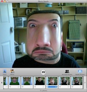
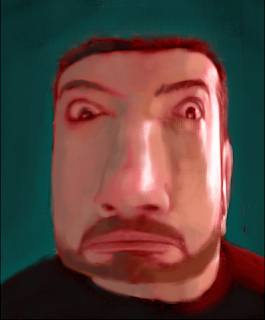
Quick digital Study in Photobooth & Photoshop


Wow - so time flies. The holidays and the new year came and went. We unfortunately hit and killed a deer that jumped out in front of our car just after Thanksgiving, and our daughter turned 1 at the end of 2007. There's been a lot going on since my last post, and obviously the blog has gotten the short end of the proverbial stick. My most sincere apologies to the Niblets.

So with that said, here's the inaugural post of 2008. After installing Mac OSX Leopard, I've discovered a fun program called Photobooth. It's a program that you can use with your iSight camera to take pictures of yourself or others a la the old photobooths at arcades, etc. There are a myriad of effects that you can add over the photo including different distortion filters. It's really a simple concept, and as you can see from the examples, the results can be hysterical and proves to be a good activity to do with your friends and family.

I started with a picture from Photobooth, took it into Photoshop, placed a red color overlay layer on it as an "underpainting," then started painting digitally on a separate layer. When I was done, I cropped it to a different proportion since the original photo was in the 4:3 ratio horizontally. I wanted this to have a more vertical portrait cropping. It was pretty quick, it only took me about 45 minutes from start to finish.